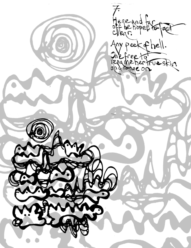
Another made by the erasure & illumination practice I been telling you about.

The source text for this one (that same minor poem late in the Exeter Book):
7.
She’ll stay true to him.
He’ll keep her name clean.
Many are steadfast,
some curious
and one too free with a stranger.
Far off, he thinks of her, hopes
where he cannot compel.
The relation of source to the poem I get to – always mysterious to me. (Just as is, the relation of those two, to the image that arrives, just as much.) But I suppose I, or someone in here, wanted to get under the surface of the sexual jealousy story, ask, what makes this he and this she tick, as they surely do.
If I’ve a worry with this one, it’s that I’ve used a filter to wash out the image so I can post it, big, to the background. A sort of move I’ve mostly foresworn. I don’t want no clipart looks here, and no Photoshop tricksies. I try to get my pretty effects from low tech – Sharpies, tree leaves. When I use high tech for effects I go for fails and distortions – scanner noise, leaf stem blur.
But I just so love how the image, blown that large, makes a surreal hillscape, and it’s gotta be grey. Left black it’s too chunky and too foreground.
Have I sold out? Thoughts, any?
And just a note to self. If I do end up feeling okay about the enlarged and greyed out forms – they have real potential for the animations. Surreal backgrounds and vertiginous shifts of scale.


You haven’t sold out, though even before reading your commentary I did find the look surprisingly slick and graphic design-y. But I think that’s because I’m seeing it onscreen. In print, I think it would have more of a Chinese watercolour look. And I’m with you about the greyscale. And the animations. Yes!
LikeLike
Yeah, slick’s the right word, it’s dangerously close to slick. Not sure which side I’m going to land here in the end. But glad you’re behind the animation idea! Maybe this is a discovery for that project, not for this one … and that’d be just fine.
LikeLike
Close to slick. Right on the edge. Still wonderful. I vote for animation too.
I wonder what would happen if the grey background was a different shape completely. Instead of loops and curves- spikes, splatters, or squares? That might shut down Slick.
LikeLike
Hmm. Hmmmmmm. Yeah I’ll mull that. I resist at first – wanting a thing to cast its shadow – but then I wonder, why should a shadow have to be servile to what it’s shadow of? Maybe a shadow takes on its own, spiky life.
LikeLiked by 1 person
Free the shadow man
LikeLike